CLIENT
THE PICKLE PANTRY
Instagram BriefClub challenge #191
MISSION
LOGO, PICKLE JAR LABEL DESIGN
The Pickle Pantry are a jarred pickle brand that require a logo and pickle jar design, plus any extras.
LINKS
MORE INFO
mock ups: licensed Freepik files
Disclaimer: This logo design was part of a timed Instagram challenge by Brief Club, and not for a real client. As such, a full logo system has not been developed.
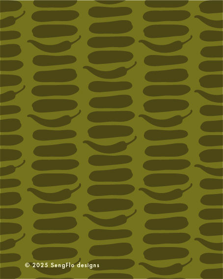
The design features a stacked arrangement of gherkin and chilli silhouettes, resembling a tower of flat stones, often seen as a symbol of stability and harmony. This represents the perfect balance of flavours—tangy, crunchy pickles with just the right hint of heat.
The colour palette reinforces this theme with a mix of natural and bold tones:
Light Cream – a soft, organic base that evokes purity and simplicity.
Hot Red – a nod to the subtle heat of the chilli, bringing warmth and vibrancy.
Khaki Greens – a range of earthy green hues, reflecting fresh, natural ingredients.
Lime Green – a zesty, lively accent that adds a fresh and energetic touch.
Together, these elements create a modern identity that highlights The Pickle Pantry’s commitment to quality, craft, and bold, balanced flavours.