CLIENT
THE COSY KILN
Instagram BriefClub challenge #197
MISSION
LOGO, MEMBERSHIP CARD DESIGN
The Cosy Kiln is a pottery club that require a logo and membership card design, plus any extras.
LINKS
MORE INFO
mock ups: licensed Freepik files
Disclaimer: This logo design was part of a timed Instagram challenge by Brief Club, and not for a real client. As such, a full logo system has not been developed.
The logo reflects what’s at the heart/h of The Cosy Kiln: a playful flame as an inviting character, ready to bring a community together, sometimes seen juggling pottery pieces.
I used a simple sans serif font (typo is New Science) and I have rounded the corners to fit the brand better, a very subtle change! - the joy of experimentation. The three stacked bars replacing the ‘E’ symbolise kiln shelves, a little nod to the patience and craft of pottery.
Whether you’re moulding clay, sipping a warm drink or simply soaking in the cosy atmosphere, this is a place to create, connect and unwind.
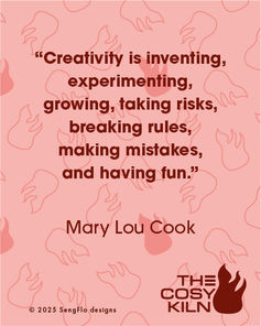
At The Cosy Kiln, creativity is always fired up!


